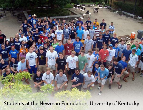
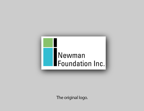
The Newman Foundation, a Catholic organization at the University of Kentucky, was in need of a logo design update. Their old logo had served them well for many years, but they were ready for something more dynamic and youthful. The Newman Foundation requested that the Arion Group keep the same colors to provide continuity, but they expressed reservations about changing the logo too much. They wanted people who had been involved with the organization for many years to still be able to relate to it.
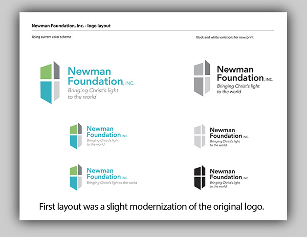
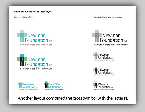
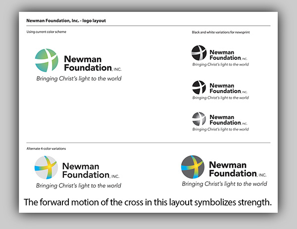
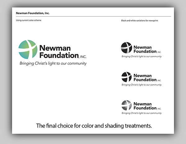
We provided several layouts, the first of which was very similar to the original logo but with a modern twist. Ultimately they decided to go with the layout above. In symbology the circle communicates unity and community, and the forward motion of the cross intersecting the circle conveys strength and vitality.
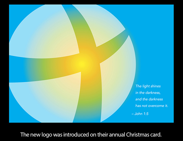
The Newman Foundation was very pleased with their updated logo and has used it extensively on stationery as well as other marketing pieces.
Advance the slide show below to view our logo redesign process.
For help updating your logo design, contact the Arion Group today.
To see more projects, return to the home page.


I really like the logo on this one!