
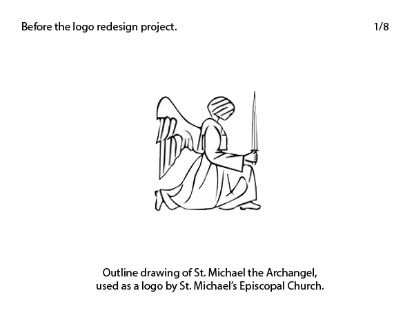
St. Michael’s Episcopal Church in Lexington, Kentucky, was in need of a more modern logo design. When their pastor contacted us, she explained that the logo they’d been using for more than 20 years had been a wonderful image, but the congregation needed a modern option. The original logo was a line drawing of St. Michael the Archangel, lovingly drawn by a member of the church.
“We want it to be more modern, an image that reflects the inclusive and welcoming members of this church,” the pastor explained. “Half of our congregation is under 45 years old, and we need a symbol that reflects youth and vitality as well as tradition.” The pastor also requested a mark that could be used alone, and was easy to print and embroider. She wanted it to be easily recognized from a distance.
St. Michael’s Episcopal Church is well established in the local community. They are actively involved with God’s Pantry, as well as several other programs that minister to a wide variety of needs in Lexington. The church is built in the Danish-Modern style, which uses clean, pure lines and classical proportions. It accurately influences the open and welcoming feeling of their sanctuary.
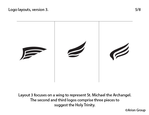
The Arion Group set about researching the history of St. Michael the Archangel, and discovered that he was used as a symbol of protection and leadership in the early church. St. Michael has traditionally been depicted as wearing wings and holding a sword.
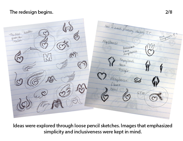
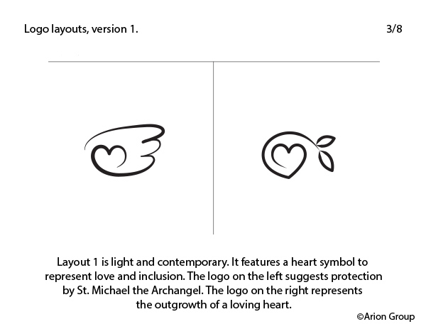
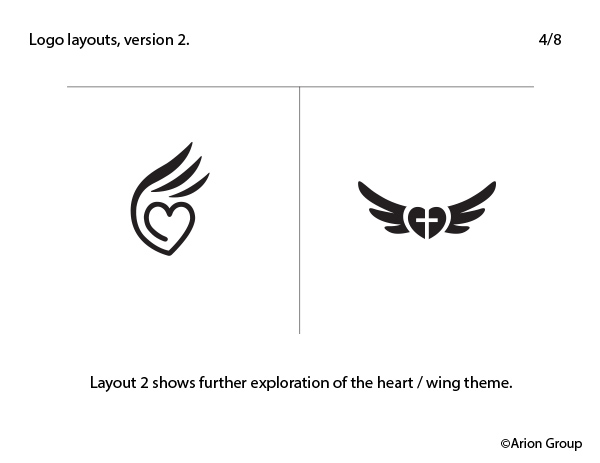
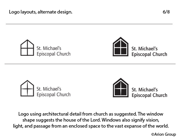
Early logo design exploration focused on creating a mark that was youthful and modern. Different variations of hearts and wings (symbolizing the protection of St. Michael) were presented. Many people on the church’s logo committee liked a couple of the winged heart symbols, but a suggestion was made to see one more layout that featured an architectural detail of the church. Since windows symbolize vision, light, and passage from an enclosed space to the vast expanse of the world, we presented a few layouts featuring the house-shaped windows on St. Michael’s building. The pointed sword of St. Michael was integrated into a cross that divides the four panels of the window.
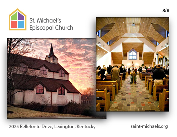
The church’s logo design committee eventually chose a bright, colorful version of the window symbol. The final version of their logo had clean lines, reflected a recognizable element of their building, and had multiple layers of symbolism that related to the mission of their church.
Advance the slides below to see a documentary of the logo redesign process.

For more information about St. Michael’s Episcopal Church,
visit http://www.saint-michaels.org.
To update a current logo, or create a new one, contact The Arion Group today.
To see more projects, return to the home page.

